

Hosted by That Artsy Reader Girl
Hi everybody, and welcome to a new Top Ten Tuesday!
Today, we talk about some cover redesigns! Sometimes cover redesigns are good, sometimes they are bad and sometimes they just annoy us because our books don’t match anymore. Either way, there’s always something to say about them, and that’s what I’m doing today. Saying something. About them. Let’s go!
Shatter Me by Tahereh Mafi

In 80% of the cases I am not a fan op people on the cover. So cover one is out. Also, this lady just doesn’t feel like Juliette to me. I don’t really get the eye thing, but those covers are pretty so let’s go with the redesigns.
Anna and the French Kiss/ Lola and the Boy Next Door by Stephanie Perkins

Again, not a fan of people on the covers. Plus the old covers feel so very bland YA contemporary to me, I wouldn’t pick them up based on the cover. Glad they changed and highlighted the settings in the new covers!
Throne of Glass by Sarah J. Maas

What is she even doing in that original cover? Flexing? Preparing to uppercut someone? Showing off her pretty little knife? Celaena Sardothien should be badass, which is way more apparent in the new covers.
The Winner’s TRILOGY by Marie Rutkoski

I don’t looove either cover that much, but it irked me that they made main character Kestrel look so badass and warriorlike in the new covers, while she’s not a warrior and her badassery comes from her strategical mind, not her fighting skills. Incorrect covers = PASS.
Carry On by Rainbow Rowell

Truthfully, I like both covers. But the artwork on the new covers is gorgeous, so let’s go with that.
The Mortal Instruments by Cassandra Clare

To be fair, the old covers needed an update. Not a fan of shirtless Jace and not a fan of weird cut-off faces. I am a fan of the beautiful art of the new covers though and am thoroughly tempted to update my collection to the new covers.
Solitaire and Radio Silence by Alice Oseman

I had no problem with the old covers. In fact, I loved the Radio Silence cover in particular. But I also love matching things and the new covers match beautifully, so both are a win to me.
The Grisha trilogy by Leigh Bardugo

Also on this cover redesign I have no favorites. I love the buildings in the first ones. And I love the art in the new ones.
An Ember in the Ashes / A Torch Against The Night by Sabaa Tahir
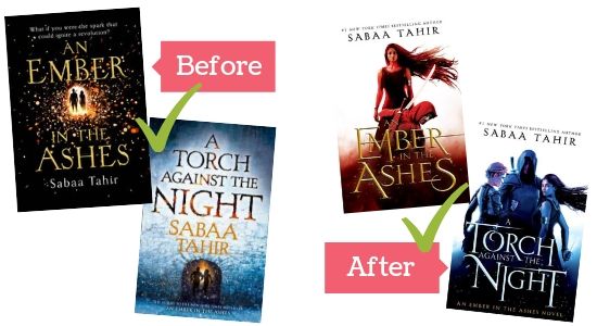
I love a good simple cover with typography, so I have always liked the original covers. However, the new covers feature a POC on them, so they are pretty epic (and necessary) in that way. So though I like both, I’m happy they made this change in covers!

I agree on every single one of these, including the ones where it’s a stand off tie. I will say the ones that have a tie – I wish they had all got finished in those copies, so we could have our sets but ah well – they all look great.
Yeah, I do love when my books match as well – but if the covers are pretty then it’s also nice 🙂
The Shatter Mew covers- I definitely love the redesign. Huge improvement. Same for Throne of Glass. And agree on the Clare covers too- I love the artwork on the new ones.
Radio Silence I’d have to agree, although I like ths version too https://www.goodreads.com/book/show/30653843-radio-silence
Also the Bardugo ones- I think I like the redesign.
Oh yeah I forgot about that Radio Silence cover, but it is really beautiful as well! Feels very fitting to the feel of the story somehow.
Never read “Shatter Me,” but by all accounts these redesigns seem really well suited. Also the Stephanie Perkins are SO darn cuuute! Haven’t read the Winner’s series yet, either, but from what I understand, the redesigns are horrible because they just don’t suit the characters and story. Glad they did release the third book as the original cover art, too.
Those Stephanie Perkins covers do really fit the cute content 🙂 Yes, it’s such a pity when a cover doesn’t match the characters or story at all…
Many of these made my list as well! I agree with you on most of these, though I must say I prefer the redesigns for The Shadow and Bone trilogy.
I did like the older covers as well, but those redesigns are pretty gorgeous too!
Yeah I don’t understand the winner’s trilogy change. The first covers are so much more fitting.
Indeed, sometimes change isn’t for the better!
Thank god for the redesigns on Throne of Glass and Am Ember in The Ashes!
Absolutely!
Great list! I love the Carry On redesign. 🙂 One of these days I need to give The Winner’s Trilogy a try – it’s a shame they haven’t portrayed the heroine well in the redesigns.
Thanks! Yeah, it’s a shame, I’m happy I’ve still gotten the old covers. Hope you enjoy the series despite the covers though! 🙂
Totally agree about The Anna and the French Kiss books. I love the ombre!! I have slight nostalgia for the old covers– but I KNOW that the paper back ones are way more pleasing to the eye.
And YES to Carry On. It was good before, but that art work on the paperback is PERFECTION!!
Yeah you’re so right, the use of the ombre is so nice and the entire cover looks so pleasing. And agree that the new Carry On cover is absolute perfection 🙂
I’d say that half of the blogs I visited so far this week included that Shatter Me cover. It’s amazing.
Haha yeah, I think it’s definitely one of the most loved cover redesigns out there today!
The double check marks on Carry On legit made me LOL at work. They are both nice covers though. 🙂
Top Ten Tuesday.
Haha, happy to have made you laugh! I just couldn’t resist adding that second check mark, it’s just such a nice cover 🙂
I love how you did this. So far I agree with all of yours!
Thanks so much! 🙂
I definitely think the Mortal Instruments covers improved. I agree with most of your assessments, actually.
Thanks! Yeah those new Mortal Instruments covers are just so nice!
Not to be repetitive and just agree with all of the things you just said but like… I AGREE WITH ALL OF THESE. And that’s really all that can be said? Also, I could stare at both editions of Carry On all freaking day. ALL. FREAKING. DAY. I really need to get my hands on the newer edition still. I rushed out to buy the original one around the time it first came out and then I just kind of missed that they redesigned it–I only noticed they did this freaking year because clearly I live under a rock.
I’m rambling. SORRY! Great picks. All of ’em.
Haha glad to hear you agree 🙂 And I totally understand what you mean, I really want that new edition of Carry On as well, just to look at the pretty!
I completely agree with you about the Throne of Glass books and the Cassandra Clare series. The newer covers are so much better.
Yeah, so happy they changed those covers 🙂
For some reason I thought the Throne of Glass “After” covers were the originals ?? but I agree they are way better!
Haha, then at least you got a pleasant surprise! (Though I’m weirdly curious as to how the other covers would have looked like if they kept the original cover style…)